Mondial Relay — improving the send journey
Sole designer on the send journey for a French parcel network. Over 15 months, conversion went from 30% to 43%.
Screen recordings are in French — the app was never localised. I ran research in French throughout.
Context
I joined just after the send journey shipped as an MVP. Conversion was sitting around 30% on both platforms, and nobody could say precisely why.
I worked with a Product Manager, Engineering Manager, Project Manager, and a Product Growth Manager on the business side, across a team of 8 engineers — 3 Kotlin, 3 SwiftUI, 2 backend-to-frontend. I was the only designer.
Finding the problem
Rather than redesign on instinct, I went into the funnel data. The point-selection step stood out immediately: users were spending over three minutes choosing a locker, and it was the steepest drop-off in the journey — we were losing roughly 20% of them right there.
That single finding set the priority for everything that followed.
Constraints
Features
Users could only search by postcode or city, then navigate the map manually to find a locker. Following industry convention, we let them enter a precise address instead. A small visual change — it doubled conversion at that step.
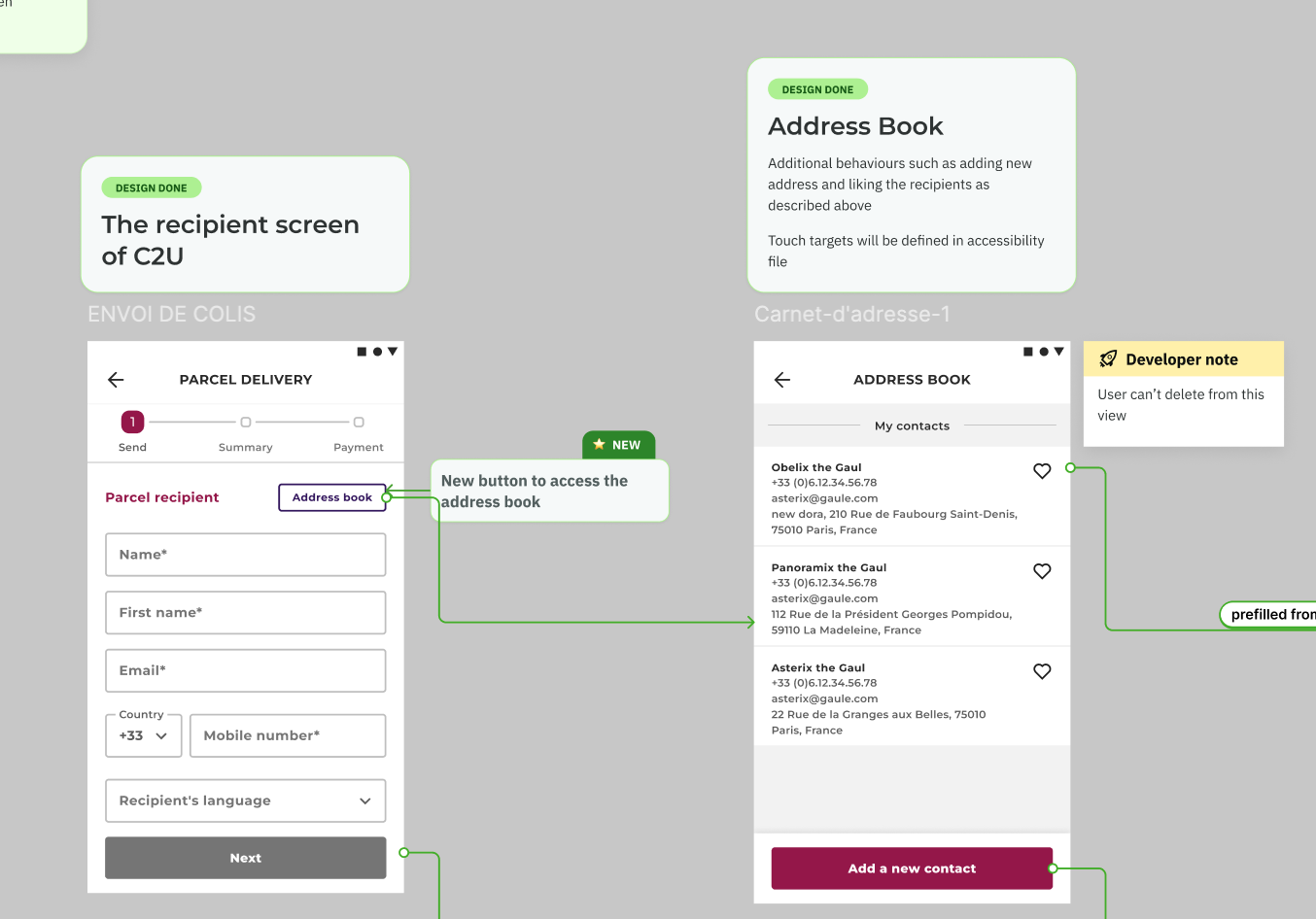
Recipient details and preferred delivery points, saved and pre-filled. Getting this server-side meant pushing backend work into a roadmap that hadn't planned for it. It's the main reason time-on-task dropped by three minutes.
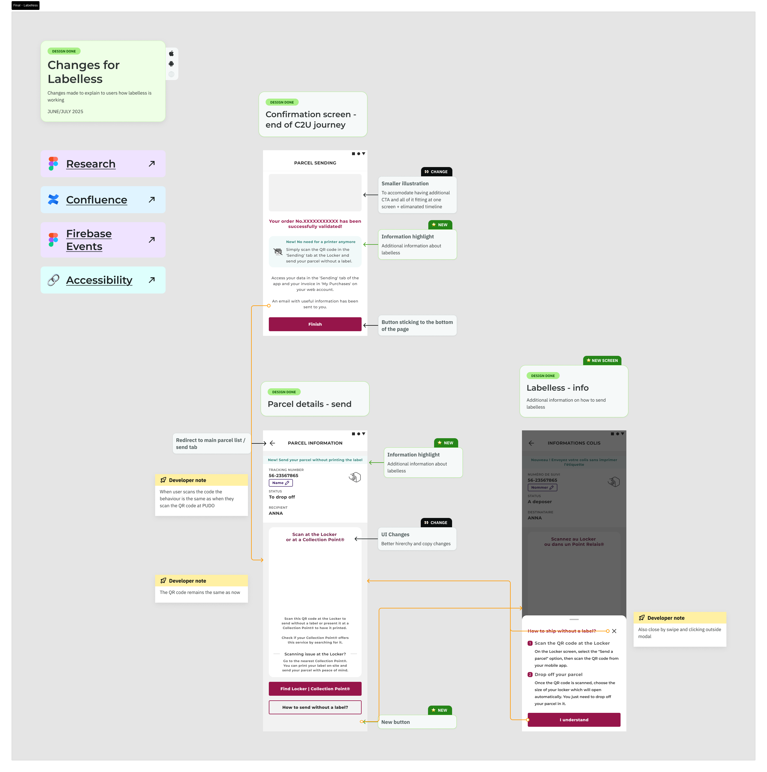
Designed and usability-tested a flow for sending parcels without a printed label. It was pulled before launch when logistics readiness fell through. We validated it early enough to lose weeks rather than quarters — which is the point of testing before you build.
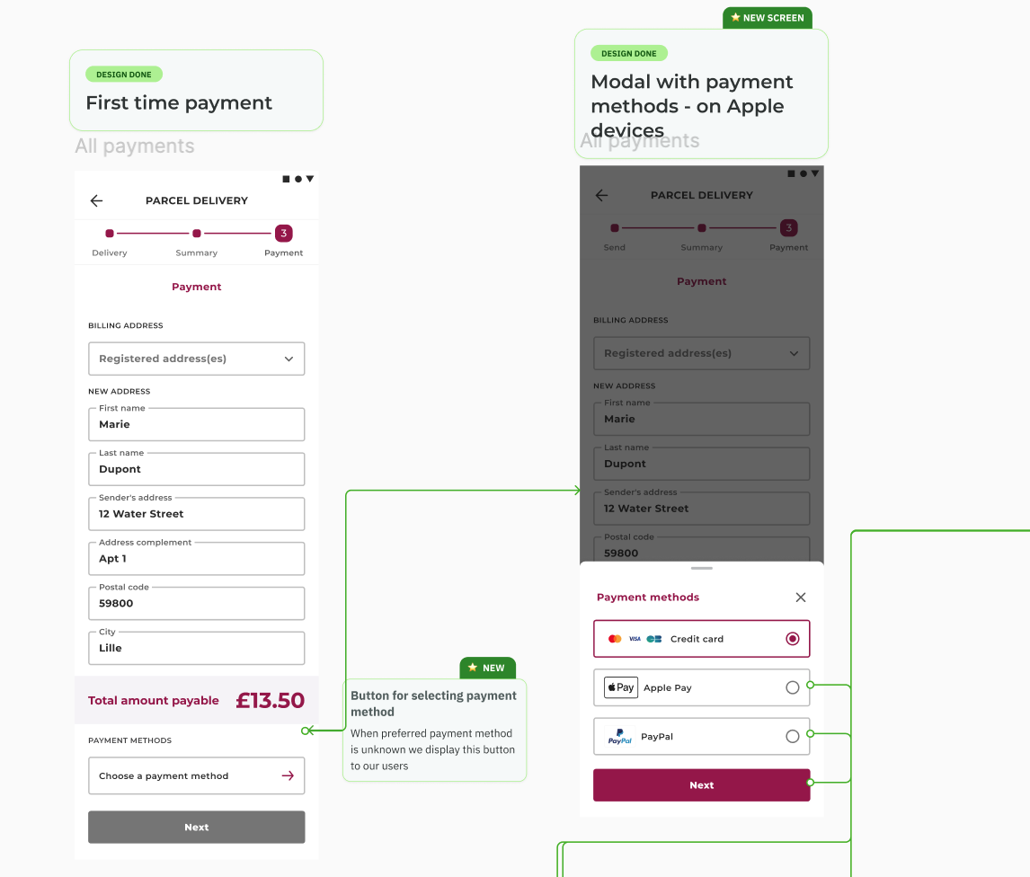
Added alongside the existing card flow, integrated independently of Adyen. This lifted conversion at the payment step by 5%, increased revenue per label, and reduced our dependency on a single provider's infrastructure.
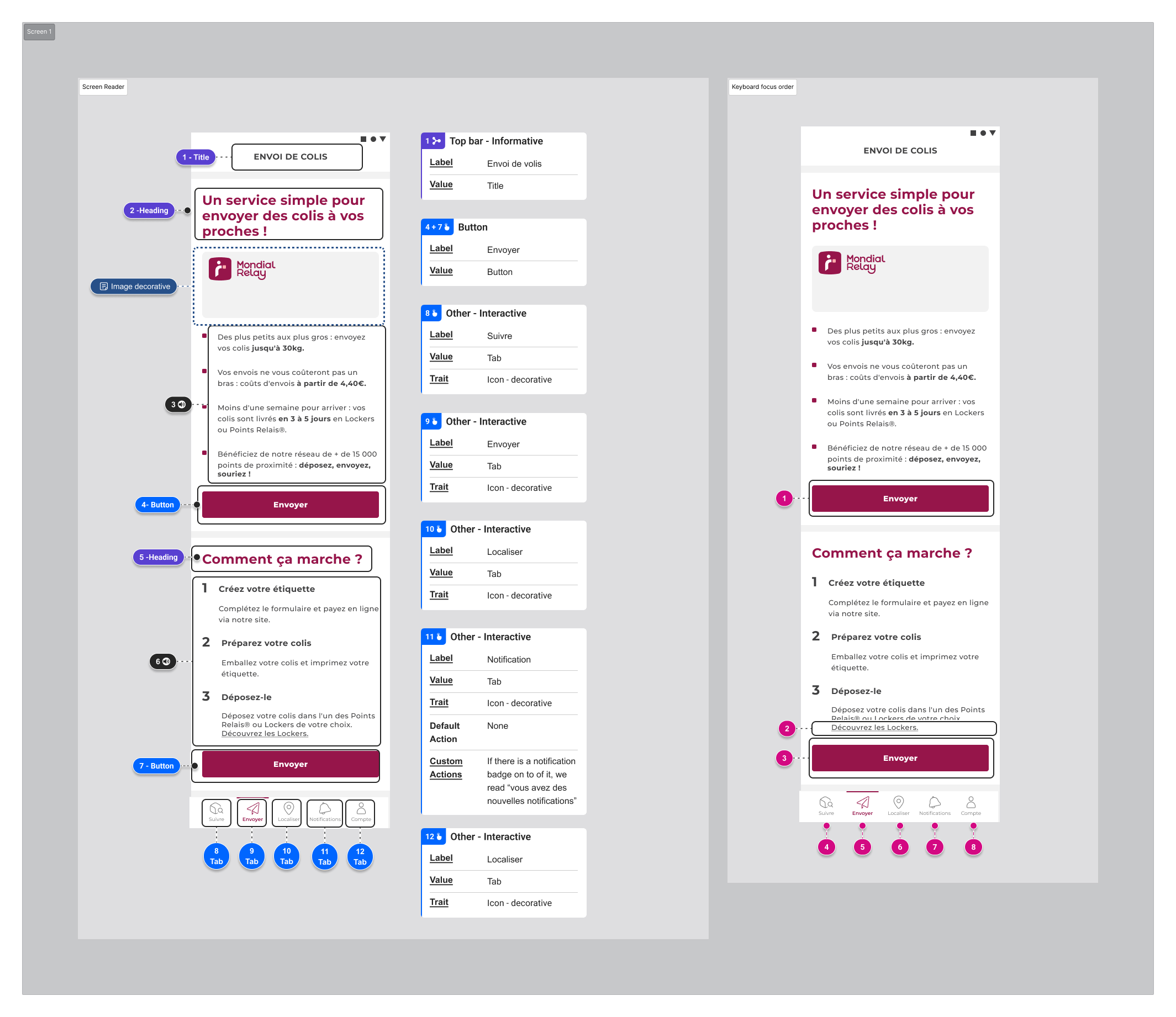
Ahead of the European Accessibility Act's requirements on payment accessibility, I documented the full send flow for compliance. The send flow passed the audit with no critical issues. Two criticals surfaced elsewhere in the app, outside this scope, with 38 items in total to address across iOS and Android.
Outcome
Conversion on the send journey went from 30% to 43% — a 13-point lift — and time on task fell by three minutes. The gains compounded: fixing point selection, removing re-typing, widening payment options, and clearing the accessibility bar each moved a different part of the same funnel.
Reflection
The most valuable thing I did on this project wasn't a screen — it was reading the funnel before touching anything. The three minutes users spent hunting for a locker was invisible in the design and obvious in the data. Fifteen months on one journey taught me that the compounding wins come from staying long enough to measure what you shipped and then go again.