Source Digital — simplifying a campaigns platform
An ad-tech platform that required a full sales team to onboard every client. The goal was to make it self-serve — without losing the flexibility power users depended on.
In ambiguous legacy systems, the fastest path to clarity is often a working product in real hands.
Context
Source Digital provides programmatic and contextual advertising for publishers across mobile, web, and CTV. Historically, every new client required hands-on support from the sales team to set up campaigns — a bottleneck to growth, and impossible to scale.
I was the only designer on the project, working with two product managers, the Head of Engineering, and a junior developer. Three weeks for design, four for build — which ran to six.
Problem
The platform required a human in the loop for every onboarding. That wasn't a people problem — it was a design problem.
Campaign creation was a single dense form: cluttered, unclear, overwhelming. Competitors kept their UIs behind onboarding, making benchmarking difficult, and quantitative usage data was scarce. The task was to design for scale with limited visibility into how the platform was actually being used.
Constraints
Approach
Four methods, chosen because the quantitative data wasn't there:
Usability testing changed the product: testing on programmatic advertising surfaced a gap that led to a new centralised settings feature that hadn't been in the original scope.
Design decisions
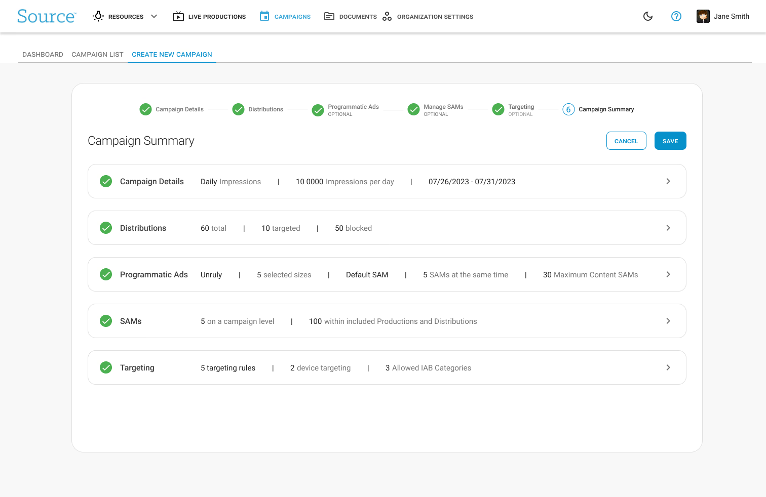
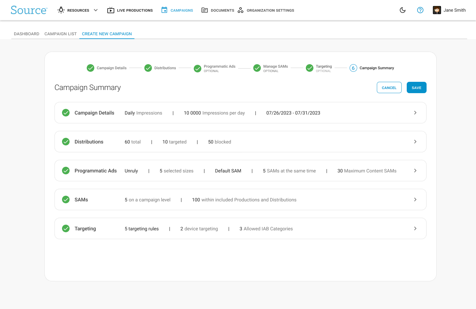
Stepper for campaign creation
Replaced the single dense form with a staged flow, directly addressing sales team feedback about cognitive load when editing. Progress became legible.
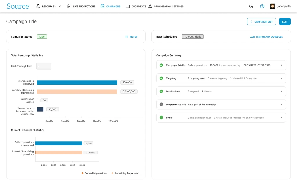
Campaign dashboard
A central hub with analytics, a "campaigns to watch" section, and a calendar widget — surfacing status information users had been hunting for manually.
Progressive disclosure
Advanced and edge-case settings moved into secondary tabs, keeping the primary path clean while preserving flexibility for power users.
Ship, learn, iterate
With unclear usage data, we launched the MVP intentionally imperfect rather than guessing what to cut. I also descoped geotargeting from the build cycle to protect the timeline.
Outcome
The redesign shipped as the platform's first self-serve campaign flow, taking the sales team out of the critical path of onboarding. Internal users reported reduced cognitive load and easier editing, and responded well to the per-campaign dashboards, which made analytics visible without hunting for them.
I left Source Digital before adoption data was available, so I can't claim a conversion figure. What I can point to is what changed in the product — and what changed after real use.
Three weeks post-launch I ran follow-up interviews with the sales team and shipped a second round:
Reflection
This project sharpened my instinct for when to ship versus when to wait. With a small user base and no usage data, the most valuable research came after launch. Closer engineering collaboration earlier would have saved time reverse-engineering which features were actually live.